- Commerce,
- Growth,
- Experimentation
E-commerce A/B Testing: A Step-by-Step Guide to Get Started


The race to convert is no longer just about having a compelling product or service. It's about
perfecting your online shopping experience,
understanding your customer's journey, and
making strategic decisions based on data.
The key to achieving this lies in A/B testing — a simple yet powerful tool that can significantly improve your conversion rates.
Why Is A/B Testing Important for E-commerce?
In summary, A/B testing is a powerful tool that can significantly impact the success of an e-commerce business. By continually testing and optimizing your website, you can ensure you're providing the best possible experience for your customers, ultimately leading to increased conversions and revenue. Here is a more detailed look at why A/B testing is crucial for e-commerce:
Improved Content Engagement: Through A/B testing, you can determine what type of content resonates best with your audience. This could be anything from headlines and product descriptions, to images and calls to action.
Lower Bounce Rates: If visitors are leaving your site without interacting with it, A/B testing can help identify the issues causing this behavior, allowing you to make the necessary changes and lower your bounce rate.
Enhanced Conversion Rates: A/B testing can directly impact your conversion rates by allowing you to tweak and optimize various elements on your site, such as buttons, forms, layouts, and more.
Reduced Cart Abandonment: By A/B testing different aspects of your checkout process, you can identify and fix any elements that could be causing customers to abandon their carts.
Data-Driven Decisions: A/B testing provides concrete data to base your decisions on, rather than just relying on gut instinct. This can lead to more effective, results-driven decisions.
E-commerce A/B Testing Ideas
Here are some A/B testing ideas that are proven to be converted more and can be beneficial for your e-commerce website:
Example 1: A/B Testing the Product Descriptions
Product descriptions play a crucial role in e-commerce as they provide potential customers with important information about a product's features, benefits, and uses. They can greatly influence a customer's decision to purchase.
Long vs. Short Descriptions
In the context of A/B testing, you could create two versions of the same product page, one with a long description and one with a short one.
The long description might include detailed information about the product, its features, how to use it, and why it's beneficial. This can be particularly useful for complex products or ones that are higher in price, as customers may require more information before making a purchase decision.
The short description, on the other hand, would provide a concise overview of the product, hitting just the key selling points. This might be more effective for simpler products or for customers who prefer to quickly scan information.
Technical vs. Non-Technical Language
Similarly, you could test descriptions that use technical language against those that use non-technical, everyday language.
A technical description might use industry-specific jargon and detailed specifications. This could appeal to expert users or professionals who are familiar with the terminology and are looking for specific features.
A non-technical description would avoid jargon and explain the product in simple, easy-to-understand terms. This would likely appeal to the average consumer who is not an expert in the product's field.
Example 2: CTA A/B Testing
CTA buttons are one of the most important elements on your e-commerce site. They guide users towards taking the action you want them to take, whether that's making a purchase, signing up for a newsletter, or downloading a guide.
Color: The color of your CTA button can have a significant impact on its visibility and click-through rate (CTR). A/B testing allows you to experiment with different colors to see which one grabs user attention and encourages them to click. For instance, you might try a red button against a blue one, or test a color that contrasts with your site's overall color scheme versus one that blends in.
Size: The size of your CTA button can also affect its performance. A larger button might be more noticeable and, therefore, attract more clicks, but if it's too big, it could overwhelm the rest of your content and deter users. Conversely, a smaller button may blend in more seamlessly with your design, but run the risk of being overlooked.
Shape: The shape of your CTA button is another aspect you could test. While most buttons are rectangular, you could experiment with rounded corners, circular buttons, or even more unique shapes to see what your audience responds to best.
Text: The text on your CTA button, often referred to as the "button copy," is crucial. It should be clear, concise, and action-oriented. You could test
different verbs (e.g., "Buy Now" vs. "Add to Cart")
first person vs. second person language (e.g., "Start My Free Trial" vs. "Start Your Free Trial")
include urgency (e.g., "Buy Now or Limited Stock")
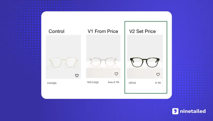
Example 3: Price A/B Testing
Pricing Display is a critical factor in e-commerce that directly impacts customer purchasing decisions. A/B testing different pricing display strategies can help you understand what's most effective for your target audience.
Savings Percentage: One strategy is to highlight the savings a customer will receive if they purchase a product. For instance, instead of simply showing the discounted price, you could display the original price crossed out with the discounted price next to it and the percentage saved clearly marked. This gives customers a clear idea of the deal they're getting, which could potentially increase conversions.
Free Shipping: Free shipping is a powerful motivator for many online shoppers. You could test displaying prices with a "Free Shipping" label against prices without. If offering free shipping universally isn't feasible, you could consider offering it once a certain order value is reached and testing the effectiveness of this threshold.
Product Bundling: Product bundling involves selling multiple products together at a lower price than if they were purchased individually. For example, you might sell a camera with a lens and a carrying case as a bundle. By testing product bundles against individual items, you can determine if customers are more likely to purchase when they perceive they're getting a "package deal."
Price Formats: Even the way the price itself is displayed can be tested. For instance, studies have found that prices ending in .99 or .95 are often perceived as significantly lower than those rounded up to the nearest dollar.
Example 4: Product Images
Product images are another critical component of an e-commerce site, as they provide the visual information customers need to evaluate a product and make a purchase decision.
Since customers can't physically touch or see the product, high-quality and relevant images become even more essential. A/B testing different types of images can help you understand what resonates best with your audience.
Images with People
Using images that feature people using or interacting with the product can help customers visualize how the product might fit into their own lives. It can also add a personal, human element to your product pages. For example, a fashion retailer might test product-only images against images of models wearing the items.
Different Angles
Providing multiple angles of a product can give customers a more comprehensive understanding of what it looks like and what its features are. You could test whether showing certain angles increases engagement or conversions more than others. For instance, an online electronics store might experiment with showing the front, back, and sides of a gadget.
Context Shots
Context shots, or lifestyle images, show the product being used in its intended environment. This helps customers imagine how they would use the product in their own lives. For instance, a furniture store might show a chair in a beautifully designed living room setting, instead of just showing the chair against a white background.
Quality and Detail
The quality and level of detail in your images can also be tested. High-resolution, detailed images can help customers better evaluate the product, but they may also increase page load times. Striking the right balance is key.
Example 5: Testing Page Layout
The homepage of an e-commerce site is often the first point of contact for visitors, so it's critical that it makes a strong and positive impression. A/B testing different homepage layouts and elements can help you understand what resonates with your audience and encourages them to explore your site further.
Layouts: The layout of your homepage can significantly impact how users interact with your site. For example, you might test a layout with a single prominent image or banner against a layout with multiple smaller images. Or, you might experiment with the placement of key elements like product categories, search bars, or CTAs.
Banners: Banners are often used to highlight sales, new products, or other important information. You could test different banner designs, positions, or messages to see what most effectively grabs user attention and drives action.
Featured Products: Highlighting certain products on your homepage can draw attention to them and potentially increase sales. You could test featuring different products, or use different criteria for selection (e.g., best sellers vs. new arrivals).
Personalized Content: Personalization can make users feel more connected to your brand and improve their shopping experience. By tracking user behavior, you can display content relevant to each user's interests. For instance, you might show products similar to those they've viewed or purchased before. A/B testing can help you determine how effective this strategy is compared to a more generic homepage.
Example 6: A/B Testing Pop-Ups
Pop-ups can be a very effective tool in e-commerce for
capturing email addresses
offering discounts
promoting special offers.
However, if not implemented properly, they can also disrupt the shopping experience and potentially drive customers away. A/B testing different pop-up strategies can help you find the right balance.
Pop-Up Designs
The design of your pop-up can greatly impact its effectiveness. You might test different colors, fonts, images, or CTAs to see what gets the most engagement. For instance, a minimalist design might work better for some audiences, while others might respond more positively to something more vibrant and eye-catching.
Timing
The timing of when a pop-up appears is also crucial. Pop-ups that appear too soon might annoy visitors who haven't had a chance to explore your site yet. On the other hand, if they appear too late, visitors might have already left. You could test different timings, such as immediately upon arrival, after a certain amount of time spent on the site, or when a user appears to be about to leave (known as exit-intent pop-ups).
Content
The content of your pop-up also plays a significant role in its effectiveness. You could test different messages or offers to see what resonates most with your audience. For example, some visitors might be enticed by a discount code, while others might prefer a free shipping offer.
Frequency
How often a pop-up appears can also impact its effectiveness and how it's perceived by visitors. Too frequent, and it may annoy visitors; too rare, and it might not reach enough visitors. Testing different frequencies can help you find the sweet spot.
Want More A/B Testing Ideas?
How Do You Find the Right A/B Testing Tool for E-commerce?
Finding the right A/B testing tool for your e-commerce business involves considering several key factors. Here's a quick look into what each of these factors means:
Testing Velocity
This refers to how quickly and efficiently you can set up and run tests. The faster you can test, the more data you can collect in a shorter period of time, leading to more data-driven decisions. When evaluating A/B testing tools, consider how quickly you can create new tests, how many tests you can run simultaneously, and how the tool helps streamline these processes.
Ease of Use
A/B testing tools should be user-friendly, with intuitive interfaces and clear instructions. You'll want a tool that makes it easy to set up tests, monitor them in real-time, and make adjustments as needed. This will save you time and reduce the risk of errors.
No Dependency on Developers
Ideally, marketers should be able to run A/B tests without needing extensive technical knowledge or relying on developers. Tools that require coding skills can slow down testing velocity and limit the number of tests you can run. Look for a tool that offers an easy usage for creating tests, so you can easily change text, images, buttons, etc., without needing to code.
Easy Analysis of the Results
The best A/B testing tools make it easy to analyze the results of your experiments. They should provide clear, easy-to-understand reports that show which version of a test performed better and why. This allows you to quickly gain insights from your tests and apply those learnings to improve your website.
High Performance and No Flickering Effect
High performance is essential because it ensures that the tool can handle a high volume of traffic, run multiple tests simultaneously, and deliver accurate results quickly. A high-performing tool will not slow down your website, which is crucial because even small delays can lead to significant drops in conversion rates.
The "flickering effect," also known as FOOC (Flash of Original Content), is a common issue in A/B testing. This happens when the original version of a page briefly appears before the test variation loads, creating a jarring experience for the user.
This can confuse visitors, skew your test results, and even lead users to leave your site. Therefore, an A/B testing tool should be advanced enough to seamlessly render the test variant without showing the original content first.
Start Testing. Start Generating More Revenue from the Same Traffic
In conclusion, A/B testing is an incredibly powerful tool for e-commerce businesses. By systematically testing different elements of your website, you can gain valuable insights into what works best for your audience and continually optimize your site to improve user experience and conversion rates.
The beauty of A/B testing lies in its simplicity.
It's about making small, incremental changes that can lead to significant improvements over time. Whether it's a headline, a call-to-action, or the timing of a pop-up, every aspect of your website holds the potential to be a game-changer.
Remember, the goal of A/B testing isn't just to increase conversions—it's also about learning more about your customers. Every test you run gives you a deeper understanding of what your audience prefers, helping you make more informed, data-driven decisions in the future.
So, start testing today.
The same traffic you're getting now could be generating much more revenue with just a few small tweaks. Don't miss out on the opportunity to maximize your e-commerce potential with A/B testing.



![4 Benefits of Headless A/B Testing [with Examples from Ace & Tate]](https://images.ctfassets.net/a7v91okrwwe3/1rAE9Eod5ybWUHtc9LEMLo/607bdcaf0512ec8f2af0f9f93dbe84f8/Ace___Tate_landscape.jpg?fm=webp&q=75&w=3840)