- Growth,
- Experimentation
Mastering Landing Page A/B Testing: A Comprehensive Guide for Success


The power to make informed decisions based on data can set you apart from your competitors.
A potent weapon in this battle for online supremacy is A/B testing - a seemingly simple, yet profoundly impactful technique that can drastically enhance your landing page's effectiveness.
This extensive guide aims to help you harness the immense potential of your landing pages by utilizing the science of A/B testing. Whether you're just dipping your toes into the vast ocean of digital marketing or a veteran looking to fine-tune your strategies, this comprehensive guide is packed with valuable insights and tactics to help you ace your A/B testing efforts.
From understanding the basic principles of A/B testing to crafting an effective hypothesis, choosing the right variables to test, analyzing your results, and implementing changes based on your findings - we've got you covered.
So, let's dive in and explore the exciting world of A/B testing, where every click counts, and every change can lead to a significant uplift in conversions.
Why Landing Page A/B Testing Is Important
Landing Page A/B testing is crucial for a variety of reasons:
Improves Conversion Rates: The primary objective of A/B testing is to identify changes that increase or maximize an outcome of interest. This could mean increased conversions, more sign-ups, or even higher purchases.
Reduces Bounce Rate: By testing different elements on your landing page, you can determine what keeps visitors engaged longer and reduce the number of people who leave ('bounce') without taking action.
Eliminates Guesswork: Instead of making changes based on hunches, A/B testing provides data-backed results, allowing you to make informed decisions about what works best for your audience.
Increases User Engagement: Understanding what appeals to your users can lead to a better user experience, which in turn can increase engagement and loyalty.
Cost-Effective: A/B testing can save resources by helping you avoid unnecessary changes that might not yield results or could even be detrimental.
Enhances SEO Efforts: Improved user engagement and lower bounce rates can have a positive impact on your site’s SEO, potentially increasing your organic rankings.
Supports Continuous Improvement: A/B testing encourages an ongoing process of testing, learning, and improving, fostering a culture of continuous optimization.
Informs Other Marketing Efforts: The insights gained from A/B testing your landing pages can also be applied to other aspects of your marketing strategy, such as email campaigns or social media advertising.
Common Examples of Landing Page A/B Testing
Now that we've established the importance of A/B testing for landing pages, let's delve into some common examples to give you a clearer picture of how this strategy can be applied in real-world scenarios. From headline variations and call-to-action (CTA) changes to complete design overhauls, A/B tests can encompass a wide array of elements.
Headlines and Copy
Headlines are the equivalent of first impressions.
They're the first thing your audience sees, and they can make or break whether a visitor decides to engage with your content or not. That's why A/B testing your headlines is so vital for optimizing your conversion rates.
The idea behind headline A/B testing is simple: you create two different versions of a headline for the same piece of content—be it a product page, blog post, landing page, or any other part of your website. Half of your audience sees one headline (Version A), while the other half sees the other (Version B).
Headline A/B testing can deliver several benefits:
Increased Engagement: By determining which headline types your audience responds best to, you can tailor your headlines to grab their attention and draw them into your content.
Improved SEO: If your A/B test reveals that certain keywords or phrases in your headlines lead to better engagement, this can also improve your search engine rankings.
Higher Conversions: Ultimately, more engaging headlines can lead to increased traffic, lower bounce rates, and higher conversion rates as more visitors are drawn into your content and encouraged to take action.
Layout
Landing pages are the gateway to your business for many visitors.
They can be the deciding factor between a user bouncing off or converting into a lead or customer. Hence, optimizing your landing page layout through A/B testing can have a significant impact on your conversion rates.
The premise behind landing page layout A/B testing is to experiment with different design elements on a landing page (this could be anything from the placement of your CTA button to the color scheme, the type of images used, or even the font size) to see which ones resonate more with users and prompt them to take the desired action—be it signing up for a newsletter, requesting a quote, making a purchase, or downloading an e-book.
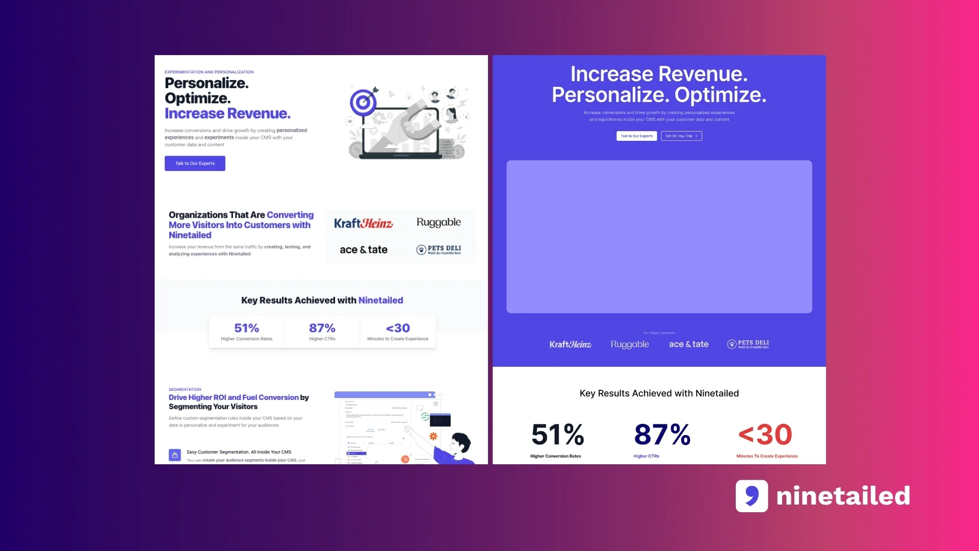
A/B testing your landing page layout can yield numerous benefits:
Better User Experience: By understanding which layout elements your audience prefers, you can create a more user-friendly and engaging landing page.
Increased Conversions: A well-optimized landing page can significantly boost your conversion rates by motivating more visitors to take the desired action.
Lower Bounce Rates: If your A/B test reveals that a certain layout keeps visitors on your page longer, this can reduce your bounce rate and potentially improve your search engine ranking.
Product Images and Descriptions
Product images and descriptions play a crucial role in online shopping as they provide customers with a visual representation of what they're buying. Therefore, A/B testing different product images and descriptions can help optimize your campaigns for clicks and sales.
The idea behind product image and description A/B testing is to experiment with different types of product images or descriptions—such as different angles, backgrounds, lighting conditions, or featuring the product in use versus standalone—and see which variation generates more clicks and leads to more sales.
A/B testing your product images and descriptions can offer several benefits:
Improved Click-Through Rates: By determining which product images are more appealing to viewers, you can optimize your campaigns to generate more clicks.
Increased Sales: If your A/B test reveals that certain images lead to higher sales, this can help you enhance your product listings to drive more purchases.
Enhanced User Experience: Understanding what type of product images resonate with your audience can improve their shopping experience on your site, potentially leading to higher customer satisfaction and loyalty.
CTA Buttons
Call-to-action (CTA) buttons are another crucial elements on your website that guide users towards conversion. Hence, optimizing these buttons through A/B testing can significantly impact your website's performance.
The idea behind CTA button A/B testing is to experiment with different aspects of the button—be it the design, size, color, or text—and gauge which variation drives more conversions. These buttons guide visitors towards a desired action, such as "Buy Now," "Sign Up," or "Download.”
A/B testing your CTA buttons can yield multiple benefits:
Increased Conversions: By determining which CTA button attributes lead to higher click-through rates, you can optimize your buttons to drive more conversions.
Improved User Experience: If your A/B test reveals that certain button designs, sizes, or colors are more appealing to users, this can enhance the overall user experience on your site.
Better Understanding of User Behavior: The results of your A/B tests can provide valuable insights into your audience's preferences and behavior, helping you make more informed design decisions in the future.
Testimonials and Social Proofs
Customer testimonials are a powerful tool in building trust and influencing purchasing decisions. Therefore, A/B testing their placement and design can significantly impact your conversion rates.
The idea behind customer testimonial A/B testing is to experiment with different aspects of the testimonials—such as their placement, design, format (text, video, etc.), or even the number of testimonials displayed—and see which variation encourages more conversions.
A/B testing your customer testimonials can offer several benefits:
Increased Trust: By determining the optimal placement and design for your testimonials, you can make them more noticeable and convincing to visitors, thereby increasing trust in your brand.
Improved Conversion Rates: If your A/B test reveals that certain testimonial placements or designs lead to higher conversion rates, this can help you optimize your product pages to drive more sales.
Enhanced User Experience: Understanding what type of testimonials (text, video, etc.) and designs appeal to your audience can enhance the overall user experience on your site.
Forms
Forms are a critical component of many landing pages.
They serve as a portal through which visitors can transform into leads, subscribers, or customers. Therefore, optimizing your forms using A/B testing can be instrumental in enhancing your conversion rates.
The concept behind form A/B testing is to experiment with various elements of your form (this could involve the number of fields, the language used in prompts, the color or size of your 'submit' button, or even the privacy statement) to identify which versions encourage users to complete and submit the form—whether it's to sign up for a newsletter, request more information, register for a webinar, or make a purchase.
A/B testing your forms can deliver multiple advantages:
Optimized User Experience: By discovering which form elements your audience responds best to, you can design a more user-centric and engaging form.
Boosted Conversions: A finely tuned form can significantly increase your conversion rates by encouraging more visitors to complete and submit the form.
Lower Form Abandonment Rates: If your A/B test shows that a particular form design or layout encourages users to fill it out completely, this can decrease your form abandonment rate and potentially lead to higher conversions and revenue.
How to A/B Test Landing Pages
A/B testing landing pages is a systematic process that involves several steps. Here's a general outline of how to go about it:
1. Identify Your Goal
Identifying your goal is the first and perhaps the most crucial step in A/B testing for landing pages. It sets the direction for your entire test and determines the metrics you need to track.
In the context of landing pages, goals typically revolve around user engagement and conversion metrics. For instance, you might want to increase the number of visitors who fill out a form (conversions), reduce the number of people who leave your page without interacting (bounce rate), or improve the amount of time users spend on your page.
The objective should be specific, measurable, achievable, relevant, and time-bound (SMART). For example, rather than simply aiming to "increase conversions," a SMART goal would be "to increase the conversion rate by 15% over the next quarter."
Having a clear goal not only helps you focus your testing efforts but also makes it easier to measure the success of the test. Your goal will guide the changes you make, influence which variant you choose as the winner, and ultimately determine whether the test has brought you closer to your broader business objectives.
Remember, the goal of A/B testing isn't just to figure out which version "wins." It's to learn more about your audience and their preferences, so you can provide a better user experience and drive more conversions in the long run.
2. Determine What to Test
Determining what to test is another critical step in the A/B testing process. It involves deciding which elements on your landing page you will change in your variant version to see if it performs better than the control version.
The choice of elements to test should be driven by your testing goal. If your goal is to increase conversions, for example, you might want to test elements that directly influence user decisions, like the call-to-action (CTA) button, form fields, or the headline.
Here are some common elements that are often tested:
Headlines: The headline is usually the first thing visitors see. Testing different headlines can help you find the most effective way to catch visitors' attention and draw them into your page.
Images: Images can have a significant impact on how visitors perceive your product or service. You could test different types of images (e.g., product images vs. lifestyle images), different image placements, or even the presence vs. absence of images.
CTAs: The call-to-action is one of the most critical elements on your landing page because it tells visitors what action they should take. You can test different CTA text, colors, sizes, or placements to see what drives more clicks.
Form Fields: If your landing page includes a form, the number and type of fields can affect conversion rates. Testing simpler forms against more complex ones can help you understand how much information visitors are willing to give.
Colors and Layout: The overall look and feel of your landing page can also influence visitor behavior. Testing different color schemes or layouts can help you understand what kind of design your visitors prefer.
3. Create a Hypothesis
Creating a hypothesis is an essential part of the A/B testing process. A hypothesis is a proposed explanation or prediction based on limited evidence, which will be further investigated during the test.
In the context of A/B testing landing pages, your hypothesis should be a clear, concise statement that predicts the expected outcome of the test. It should specify the change you're making, the impact you expect this change to have, and a rationale for why you expect this result.
For example, the hypothesis "Changing CTA button color from blue to green will increase click-through rates by 10%" suggests that you believe altering the color of the call-to-action (CTA) button to green will make it more noticeable or appealing to visitors, leading to a higher click-through rate.
It's important to note that a good hypothesis should not only predict the outcome but also be measurable and testable. In the above example, "increase click-through rates by 10%" is a measurable outcome that can be directly tested.
Establishing a clear hypothesis is beneficial for several reasons:
Focus: It helps keep your test focused on one particular element and outcome, preventing you from getting side-tracked by other factors.
Purpose: It gives your test a clear purpose, helping you and your team understand exactly what you're trying to achieve.
Analysis: It simplifies the analysis of your results. You'll be able to clearly see if the results support or contradict your hypothesis.
4. Set Up and Run Your A/B Test
Setting up and running your A/B test is the action phase of the process. This involves creating two versions of your landing page: the current version (also known as the "control") and a modified version (the "variant"). The changes introduced in the variant should be based on the hypothesis you have formulated.
Most A/B testing tools allow you to easily create these two versions and split your traffic between them. It's crucial to divide your traffic equally between the control and the variant to ensure a fair test. This means that 50% of your visitors will see the original version, and 50% will see the modified version.
Equally important is ensuring that each visitor only sees one version of the page during the test. This is to avoid confusing your visitors if they return to your page and see a different version. Most A/B testing tools automatically handle this through the use of cookies.
Once the test is set up, you need to let it run for a sufficient amount of time to collect enough data. The duration of an A/B test can vary depending on your website traffic, the magnitude of the change, the desired effect size, and the statistical significance level you want to achieve. Generally, a period of at least two weeks is recommended, but it could be longer for websites with lower traffic.
Statistical significance is a critical concept in A/B testing. It's a measure of the likelihood that the difference in performance between the control and the variant is not due to random chance. A common threshold for statistical significance is 95%, meaning there's a 5% chance that the observed difference could be due to chance.
Remember, it's essential not to stop the test too early, even if you see promising results. Ending a test prematurely can lead to inaccurate results and misguided decisions.
5. Analyze the Results
Analyzing the results is the next step in the A/B testing process for landing pages. After running the test for a sufficient amount of time and achieving statistical significance, it's time to examine the data collected and draw conclusions.
The analysis should focus on comparing the performance of the control and variant versions of your landing page in relation to your initial goal. For instance, if your goal was to increase click-through rates (CTR), you will want to compare the CTR of both versions.
Here are some steps to follow when analyzing A/B test results:
Check the Statistical Significance: First, ensure that your test results have reached statistical significance. This means that the difference in performance between the two versions is unlikely to have occurred by chance. A common threshold for statistical significance is 95%.
Compare Key Metrics: Next, look at the key metrics related to your goal. If your goal was to increase conversions, compare the conversion rates of the control and variant landing pages.
Understand the Impact: Try to understand why the winning version performed better. Did the change you made resonate more with your audience? Or did it make the call-to-action more noticeable? Understanding the 'why' behind the results can provide valuable insights for future tests.
Document Your Findings: Record the details of the test including your hypothesis, the changes made, the duration of the test, and the results. This documentation can serve as a valuable resource for future testing and decision-making.
Remember, even if your variant doesn't outperform the control, there's still value in the test. Negative results can help you understand what doesn't work for your audience, and that's just as important as knowing what does work.
6. Implement the Winning Version
Implementing the winning version is the final action step in the A/B testing process for landing pages. After analyzing the results and determining a clear winner, the next step is to implement the more successful version on your landing page.
If the variant (the version with changes) significantly outperforms the control (the original version), it's clear evidence that the changes made have positively impacted the desired metric, whether that's click-through rate, conversion rate, time spent on page, or another key performance indicator. In this case, you should replace the existing landing page with the winning variant to benefit from its improved performance.
However, not all tests will produce a clear winner. If there's no significant difference in performance between the control and the variant, or if the variant performs worse than the control, it doesn't mean the test was a failure. Instead, these results provide valuable insights into what doesn't work for your audience.
In such cases, you should use the insights gained to formulate a new hypothesis for a fresh test. Remember, A/B testing is not a one-time activity but an ongoing process of continuous improvement. It's about learning from each test, whether successful or not, and using those learnings to make data-driven decisions and improvements.
It's also important to keep in mind that even when you do have a winning variant, this doesn't mean you should stop testing. There may be other elements on your landing page that could be optimized, or the winning variant itself could potentially be improved even further. In other words, there's always room for more testing and optimization.
The Bottom Line
A/B testing, including for landing pages, is not a one-time process but an ongoing cycle of optimization. It involves continuously testing and tweaking different elements of your landing page to improve results over time.
This continuous process of A/B testing can be broken down into four main steps: developing a hypothesis, testing that hypothesis, analyzing the results, and then implementing changes based on those results. After implementing the changes, the cycle starts again with a new hypothesis.
There are several reasons why you should repeat the A/B testing process:
Continual Improvement: Even small changes can have a significant impact on your conversion rates. By continually testing and optimizing, you can make incremental improvements that add up over time.
Changing User Behavior: User behavior and preferences can change over time due to various factors like technology trends, market conditions, and competitor actions. Regular testing allows you to stay in tune with these changes and adjust your landing pages accordingly.
Risk Mitigation: A/B testing allows you to test new ideas and changes on a small portion of your audience before rolling them out fully. This can help mitigate the risk of making changes that could negatively impact your conversion rates.
Data-Driven Decisions: Regular A/B testing provides you with a wealth of data that you can use to make informed decisions about your landing page design and content. This can lead to more effective and efficient marketing strategies.
Remember, the goal of A/B testing is not just to find a "winner," but to gain insights about your audience and their preferences. Even "losing" tests provide valuable information that can guide your future testing and optimization efforts.



![4 Benefits of Headless A/B Testing [with Examples from Ace & Tate]](https://images.ctfassets.net/a7v91okrwwe3/1rAE9Eod5ybWUHtc9LEMLo/607bdcaf0512ec8f2af0f9f93dbe84f8/Ace___Tate_landscape.jpg?fm=webp&q=75&w=3840)